Deux Pieds Quatres Pouces
Deux Pieds Quatres Pouces
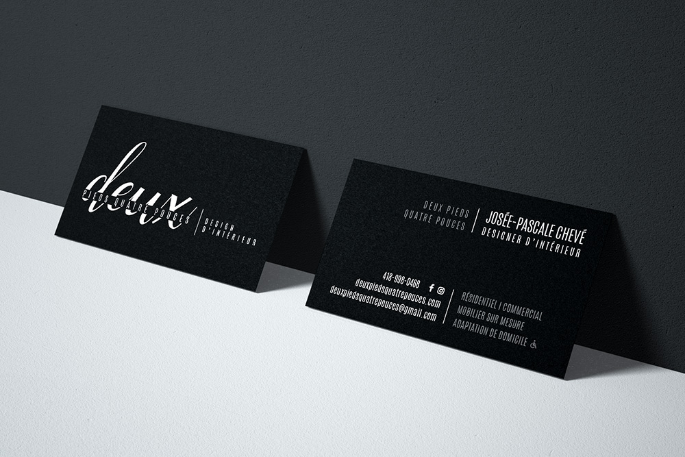
Simple, clean and refined with a touch of fantasy is exactly what was asked and delivered. She likes the movement of the calligraphic typography and the more rigid architectural feel of the sans serif font. This logo looks great on different mediums (web & print) and will pop on her design presentations without stealing the show.
Another happy client for Creative Lillie.
Client: Deux Pieds Quatres Pouces
Date: October 12, 2017
Service: Branding, Design